One problem CD-label designers face frequently is making their text legible when it's on top of a photographic background. There are two basic solutions: add a background to the text or make the photo stand out less. It's easy to do either of these in Acoustica CD/DVD Label Maker. Here's how:
Solution 1: Adding a background to your text:
1) Right-click on the text and select the "Set Background Color/Opacity" option from the right-click menu. Once the dialog pops up, select the color of background you want. If you're not absolutely confident in your color-choosing talents, you won't go wrong by choosing a white background for dark text or a black background for light text.
2) On the same dialog you just opened, try adjusting the "Opacity" slider. Partially transparent text backgrounds can add a slick, professional quality to your design. (The next time you watch TV, pay attention to how many commercials use this technique - you'll probably notice it happening all the time.) Try experimenting with white text against a black background and black text against a white background to see which looks best with your background image.
3) Click OK to save your changes, and then adjust the size of the text object to your taste. You may decide that a horizontal bar the entire width of your label looks best, or maybe one that just protrudes partway across your label. If you've got version 3.26 or higher - and if not, why not? - check out the disc layout "Dots 2" for examples of the latter.
4) (optional): For an extra twist, try invisible text against the solid background you just added. To adjust the text opacity, right-click on the text and then select the "Text Color/Opacity" option. Once the dialog pops up, slider the "Opacity" slider all the way to the left. (Again, check out the disc layout "Dots 2" for examples of invisible text against a partially opaque background.)
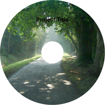
Before: without a text background
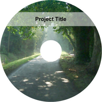
After: with text background added
Solution 2: Making the background photo stand out less
1) This technique involves reducing the opacity of your background image's layer and blending it with a lightening or darkening color, so you'll need to start by moving your text to another layer than the one your background is on. To do this, click F7 to bring up the layers dialog, then click the "New" button to add a new layer. Then right-click on your text object(s), mouse down to the "Change Layer" option on the right-click menu, and select the new layer you just created. Repeat this for all objects on your design except the background image that you want to change.
2) If you closed the Layers dialog, click F7 to open it again. Click on the background layer to select it, and then just drag the "Layer Opacity" to the left to reduce the layer's opacity. By default, it'll have a white background-blend color, so reducing its opacity will make it lighter and cause dark text to stand out against it more. If you click on the "Transparent blend color" button to change the background color to black, reducing the background layer's opacity will make it darker and cause light text to stand out more. You can also experiment with setting the background color to more exotic hues and then adjust the opacity slider to add a color tint to your background.
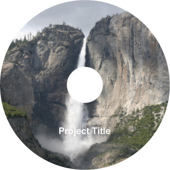
Before
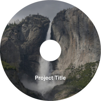
After: with darkened background
Eric V
Comments